
EDITORIAL:
MAIN ILLUSTRATIONS
I can create thought-provoking, concept-driven illustrations that bring depth and visual storytelling to journalism, features and opinion pieces.
Whether for magazines, newspapers or digital publications, I offer editorial illustrations that align with the message of each story, combining extensive research, creativity and strong composition.

My illustration, stop the genocide in Gaza, has been longlisted by the World Illustration Awards 2026 in the New Talent / Editorial section. I'm so grateful to the judging panel for deeming it worthy and to the Association of Illustrators (of which I am a member) for the recognition.
I created this work as a reaction to the horrific nightmare that kids - and adults - are experiencing in Gaza. Unicef reports that more than 50,000 children have been killed or injured since October 2023.
It was used to help Coffees for Gaza raise funds for families trapped in Gaza. More recently it was published by Wildscape Literary Journal in the May 2026 issue, calm // storm.
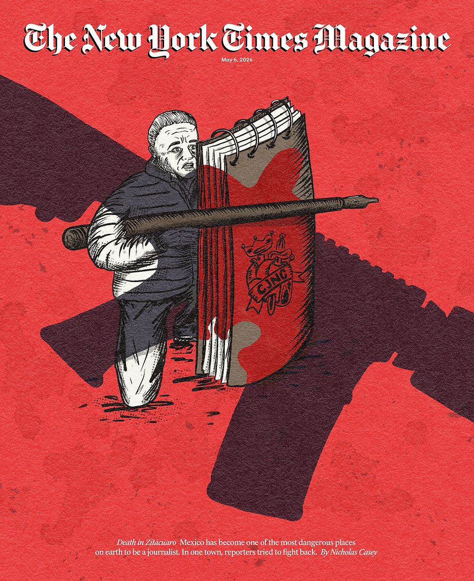
I recently created this cover for 'The New York Times Magazine' as part of an editorial course with Inkygoodness in collaboration with NYT designer Victoria Escobar. The story covered the danger of being a journalist in Mixico, particularly focusing on the life of Armando Linares Lopez, who was fatally shot by the cartel. He said he felt is only defence was a pen and a notebook, which inspired the idea for my illustration.

I created this cover for a fictional magazine I invented, "The British Magazine", as part of my degree coursework with the OCA (Open College of the Arts). We were asked to create a colour illustration responding to an article entitled ‘How green is your food?’ which I decided would focus on concern over food miles.
After creating a mind map and several thumbnails of potential compositions I chose this one, working in Procreate.
The food on the menu is arriving in the background against the backdrop of the earth. In the foreground local/seasonal food arrives on green transport that will help to keep the environment healthy: the strawberry, potato, eggs and spring onions. In the background, blueberries, a mango and the mayonnaise are arriving by air and truck, which is causing fumes and pollution.
I have anthropomorphised the food, adding humour and playfulness. The subject of food miles and how it impacts climate change can be fairly heavy and dry, so I felt that lightening up the angle in this way would encourage readers to engage with the story – and also remember the concept of food miles in the future.
The fact that this one simple menu has food coming from all over the world, local and international, shows how varied each meal can be.
This representation highlights the complexity and could even encourage people to ask where their food comes from before they order.

This mock-up cover for ALBERT was created during an Inky Goodness 'editorial playbook' course. ALBERT is a French newspaper for children and each issue combines each of the stories inside in a surreal cover concept. I relished the challenge, creating my take on issue 143, with the intention of pitching the editorial team to see if I could illustrate one of their future issues.

I created this editorial illustration as a response to a new story The Bureau of Investigative Journalism ran about illegal children's homes. In this story the organisation in question had collected £12 million in public money and then was found housing a vulnerable child in a run-down bungalow where they slept on the floor. I am searching for meaningful editorial work, so if you are seeking an illustrator who wants to work on projects that make a difference, please do get in touch.

For my illustration degree coursework, we had to create a page for a magazine illustrating the life of a famous person. I chose Vanessa Redgrave!

This wasn't an actual commission from the New Scientist, but a brief that I worked on for the six-week Editorial Playbook course from Inkygoodness. You can read the case study here. We have permission to use the header as long as we state clearly that it is the result of a personal project.
The article put community and social connection as crucial to human longevity. At one point the writer says that close relationships positively affect our hormones, our immune systems and even how our genes are expressed.
After several sketches and colour roughs, this idea was brought to final artwork. I decided to use the idea of the maypole, a traditional, event that brings a diverse community together young and old. I felt I could make the author's point visually by making the ribbons from DNA.
Often maypoles have something at the top, this one has a heart for health and a '100' to indicate the goal age, pointing back to the story.

This is personal work for Youpi Doc, a French magazine aimed at children who I would very much like to illustrate for in the future. I created this cover image, based on the magazine's theme of 'Pourquoi faut-il se laver?' (why we have to wash ourselves) and created my own version. I copied their magazine title and cover elements to make it look realistic, but, as explained, this isn't the official cover, it's my design based on their theme.

As part of my illustration degree with the Open College of the Arts, I created an editorial illustration based on an article from The New Yorker by D. T. Max, entitled Can Turning Office Towers into Apartments Save Downtowns?
The piece focuses on FiDi, Manhattan’s financial district in New York, and how property developer Nathan Berman is buying up office buildings – nationwide they are “only 50% full” – and transforming them into residential apartments. So far he’s converted eight in the area.
Partnering with architect John Cetra, the writer highlights a building on 55 Broad and how its 400,000-sq-ft of office space is being gutted and redesigned into one-bed or studio apartments aimed at young professionals and generating a potential annual rental income of $30 million.
When discussing his process, Berman described “the effort to extract as much residential space as possible out of such buildings to solving a Rubik’s Cube.”
Later, 55 Broad is described as both “a three-tiered wedding cake” and “a dull stack of boxes.” Taking a closer look at the building myself through Google Maps and various architectural sources, I began to see how the ideas of the Rubik’s Cube, wedding cake and this lucrative business “marriage” between Berman and Cetra could inspire a conceptual illustration to accompany the article

This illustrated map of the Aude region in France shows some of the most exciting, family-friendly destinations in the department.
Living in the same region, and in the department next door, the map highlights twelve locations I personally recommend for families planning a summer trip, combining travel illustration with practical insights for exploring the Aude. Perfect for parents seeking child-friendly travel ideas in France, the map brings each location to life through engaging, hand-drawn visuals.
.png)
This editorial and digital illustration visualises a key aspect of news coverage on the California wildfires in January 2025, highlighting the use of inmate firefighters, who make up a significant portion of the state’s wildfire response force.
Nearly 40 % of Californian prisoners are Hispanic, almost 30 % are Black, 20 % are White and the remainder classified as "other".
According to the BBC, 900 incarcerated firefighters were deployed to fight the fires, while the LA Times reports that inmate crews account for up to 30 % of the state’s wildfire workforce.
Inmates are paid between $5.80 and $10.24 per day, compared with the state minimum wage of $16.50 per hour. By contrast, non-prisoner firefighters earn between $147,000 and $352,000 per year.
This illustration is suitable for news publications, magazines and digital editorial features, communicating complex social and economic issues clearly through visual storytelling.